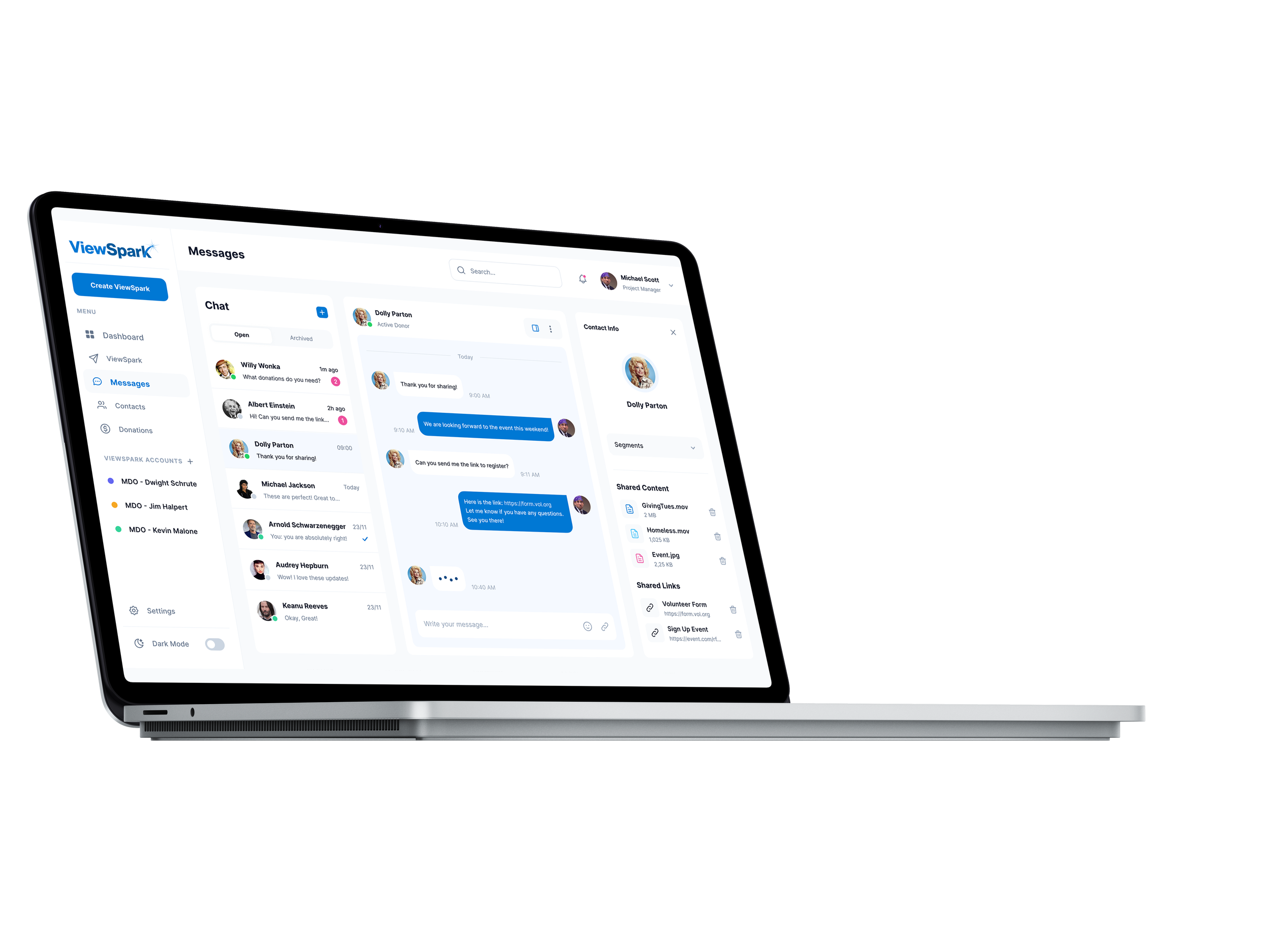
ViewSpark Dashboard Redesign
The goal of this project was to redesign the ViewSpark dashboard to create a more intuitive, modern, and data-driven user experience. The previous dashboard provided basic functionality but lacked clear visual hierarchy, streamlined navigation, and engaging data visualization. My task was to reimagine the interface so users could easily create, manage, and measure the impact of their donor communications.
Challenges Identified
Overwhelming data presentation with limited visual clarity.
A dated interface that lacked modern design patterns.
Difficulty for users to quickly interpret metrics like open rate, click rate, and delivery performance.
A need for stronger alignment with ViewSpark’s mission of helping nonprofits tell their stories in real time.
Design Approach
Clarity – transforming raw numbers into visually digestible charts and graphs.
Hierarchy – restructuring the layout so the most critical metrics (deliveries, opens, clicks, donations) stand out immediately.
Consistency – applying a modern design system with cohesive colors, typography, and iconography.
Action-Oriented Design – making it easier for users to quickly create new campaigns, view performance, and take next steps.
Before vs. After
Before: A flat, form-like interface with minimal visual guidance. Users had to scroll and parse through multiple unlabeled fields with little design hierarchy.
After: A modern, structured editor that highlights the storytelling elements (media + message), simplifies inputs, and creates a more engaging, guided experience for the user.
Before vs. After
Before: Dense blocks of numbers with minimal visual engagement. Key insights like open rates and donations were buried in the data.
After: A modern, card-based dashboard with intuitive graphs, segmented metrics, and clean navigation that helps users focus on what matters most—measuring donor engagement and campaign success.


