ViewSpark Conference Revamp
The goal of this project was to completely refresh ViewSpark’s presence at conferences, ensuring the booth, collateral, and branded items clearly communicated the platform’s value and created a cohesive, professional brand experience.
Challenges Identified
Previous booth design lacked visual impact and didn’t communicate the platform’s core message effectively.
Marketing collateral felt outdated and inconsistent across formats.
Conference presence needed to stand out in a crowded exhibitor space while still feeling approachable to nonprofit leaders.
Design Approach
I developed a bold, unified design system for the booth, handouts, and giveaways that emphasized clarity, consistency, and engagement.
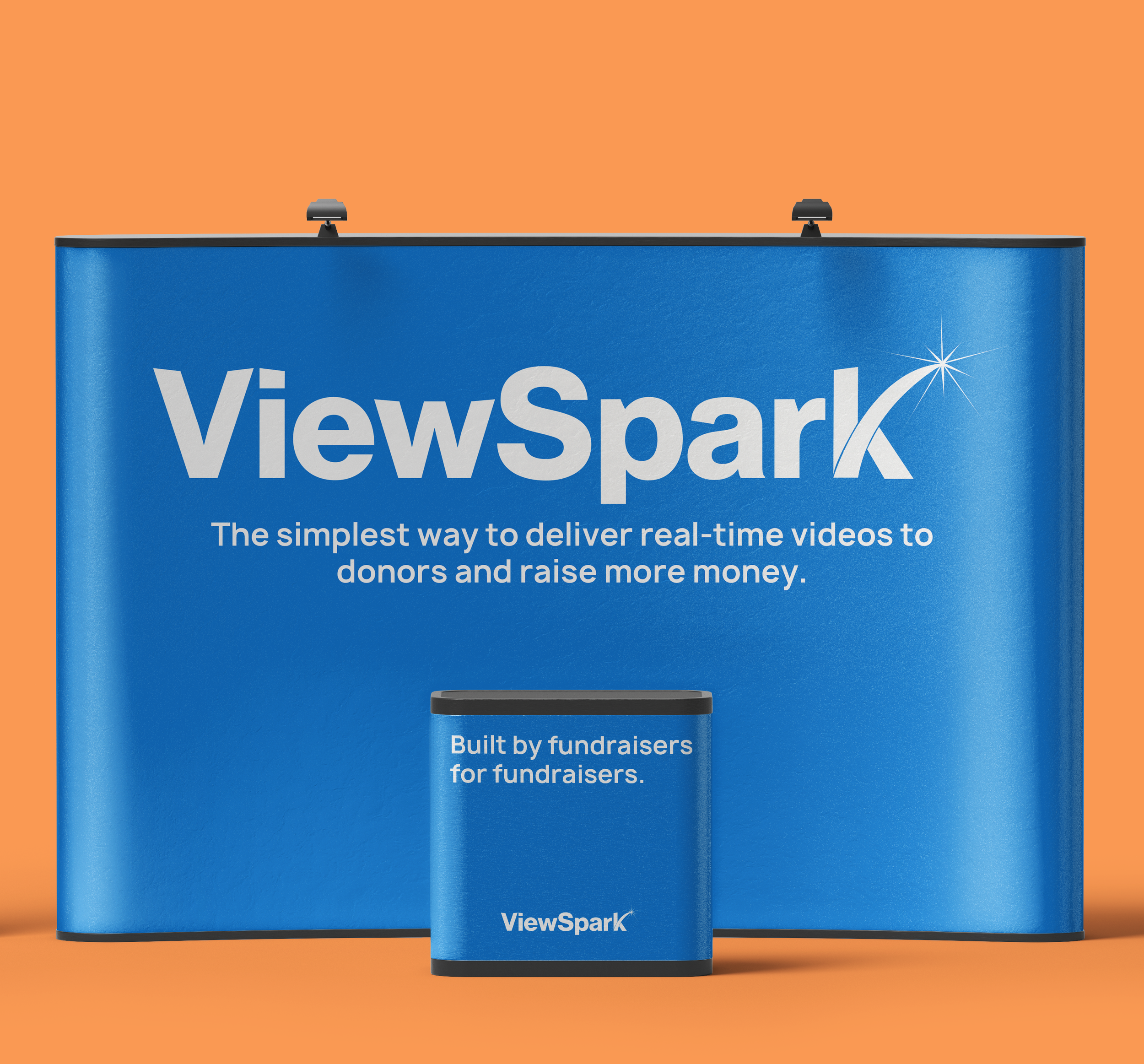
Booth Design – streamlined with strong brand color, clear tagline, and bold typography to make messaging instantly recognizable from across the exhibit hall.
Collateral (Handout) – designed with a clean layout, concise messaging, and brand visuals to explain product value quickly and clearly.
Branded Giveaways (Pins) – playful “Spark” messaging variations (Spark Change, Spark Impact, Spark Happiness) to reinforce brand language and encourage organic sharing.
Before vs. After
Before: An outdated booth setup with unclear messaging and low visual energy. Collateral and branding felt disjointed.
After: A high-impact, modern booth with clean visuals, cohesive collateral, and branded merchandise that created a consistent conference identity.


